REI Camping Website
The brief I received had clear parameters for the featueres of the desktop website I was tasked with designing. That is: create a site where one can plan and book a camping trip. The site had to have a social component and interact checklists where users can assign items to bring for one another. I feel that this was a great exercise to further develop the design process. There was a lot of freedom to discover and ideate your own vision for this project. My goal was to try and integrate the social component and interactive checklists as seamless and and easy as possible.

Aspects I considered
- Allow users to find and book camping destinations.
- Allow users to discover and book (if applicable) other outdoor activities to take part in while camping.
- Provide an interactive trip checklist based on location, time of year, age of campers, types of activities planned, number of campers in group, and any other important criteria that arises during user research.
- Provide a way for multiple campers to plan all aspects of a trip together.
- Allow users to purchase products available already on REI.com directly from this new website.
My role
This was a solitary project so my role covered the spectrum of the UX design process starting with domain research, competitive analysis, user interviews, sketching, site maps and user flows, wire framing, testing and visual design.
The first thing I did was dive into the research phase. For my initial domain research I looked at the 2014 American Camper Report presented by Coleman Company, Inc.
Next I sent out a screener survey which allowed me to find people to talk to in the market segment. I received 96 initial responses generated by leveraging social media. I also completed an heuristic evaluation and competitive analysis.

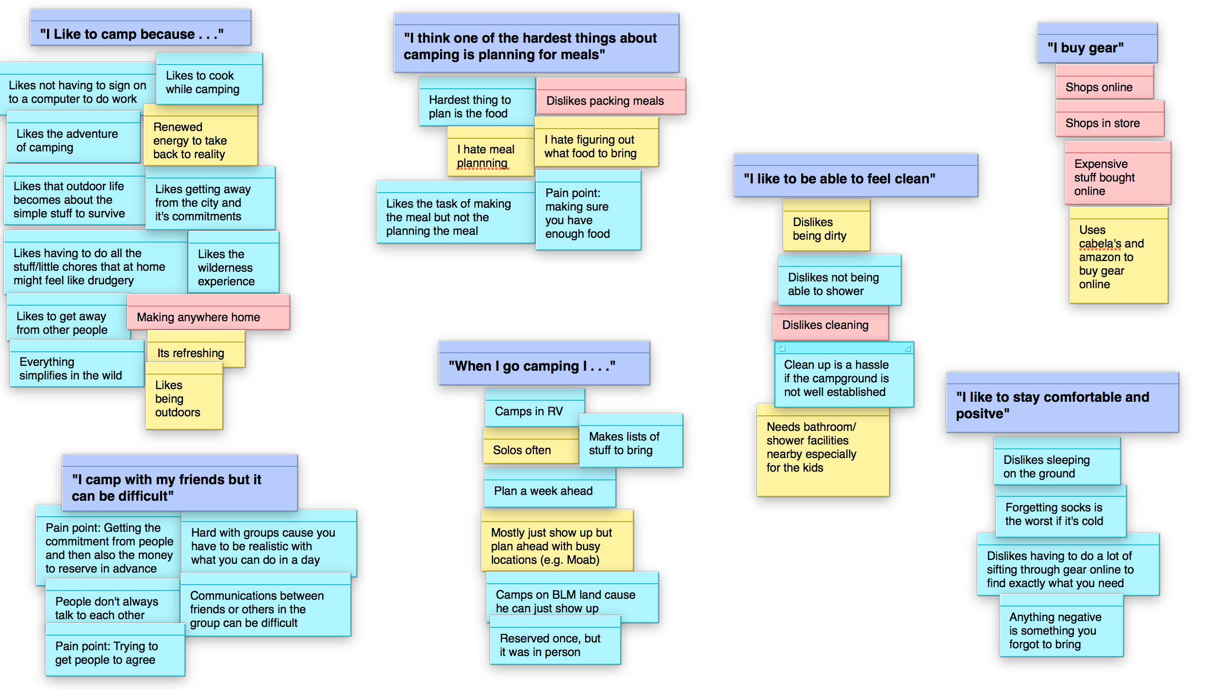
After the interviews I began planning the information architecture for the website by creating and iterating on several site maps and user flows. I also took the raw data from my interviews and created an affinity map to focus and group themes. The latter also informed the final IA, site map and user flow.